
Remember in April when Google released its latest algorithm change and with that a mobile update? Suddenly mobile-friendly sites became Google's BFFs. Since then it has become mighty clear that you need to optimise your site for tablets, smartphones and other portable devices your customers might be searching on, or else Google will penalise you. As a marketer, you know your website design and its functionality are not only key to your marketing but also the key to beating the competition.
Even though it's been a few months since the update has been released, you might still feel a little lost as to what to do with your website. In a recent blog post, HubSpot’s Dan Slagen compiled 16 of the Best Examples of Mobile-Friendly Website Design to get your creative juices flowing.
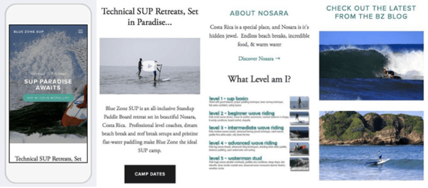
Blue Zone SUP
Blue Zone SUP is a stand-up paddle boarding camp in Costa Rica, and after seeing their mobile site, we totally want to go. Their site begins with an enchanting hero image, followed by a quick company description and well-produced video that works really well on mobile. They also show visitors a nice chart they can measure their skill level by on a scale of one to five. This way, when browsing camp dates (which is offered via call-to-action button under their video), visitors will know which weeks are most applicable to their skill level. To showcase more of the company culture, Blue Zone provides links to blog articles and additional imagery.
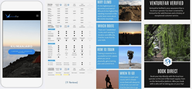
VentureFar
VentureFar's mobile website has a difficult goal: They need to convince users to climb Mount Kilimanjaro ... on a cell phone. What's impressive about the site is that they actually do a really good job. Starting off with a postcard image of the mountain, they immediately offer users the ability to compare tour-operating prices. (Yes, they know their demographic well.) They also include one of the better mobile responsive charts we’ve seen, which includes a simply designed but detailed chart showing all the tours they offer. Finally, their homepage ends with a short blurb answering frequently asked questions, like “Why Climb?” and “When Should You Go?” Being a remote tour company, VentureFar is also sure to include details on their licenses/verifications and options to book direct.
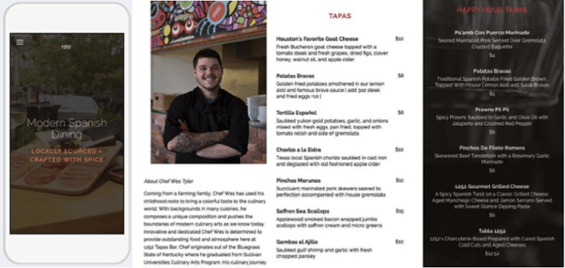
1252 Tapas Bar
What would you want from a tapas bar's mobile website? If you answered food pictures, a blurb about delicious, locally sourced food, and menus, then you'll love this website as much as we do. Their full menu is designed to be mobile responsive, so no pinching and zooming is needed. They also tell a charming story about their head chef, Wes Tyler right on the homepage, which gives a welcoming feel to this local restaurant.
While the page has all of the relevant contact information and hours of operation, we love the special offering at the bottom of the page, which highlight 1252’s weekly food-and-drink specials with delicious-sounding descriptions.