When you create a call-to-action (CTA) you want your prospects to click. In an ideal world your CTA would be so irresistable that your leads just can't help themeselves but hit that "action" button with force. But how do you create such a CTA, and more importantly, what does a truly seductive CTA look like? In her recent story on the Content Marketing Institute blog, Julie Wingerter has compliled a list of interactive CTAs every B2B marketer should draw some inspiration from. Here are our two favourites:
Assess
The theory of narrative psychology tells us people love to be the star of their own story. That’s why personality tests (like the ones found in magazines and on BuzzFeed) are so powerful – they give us a chance to categorise ourselves and share that snippet of who we are with the world. As humans, we respond to the “assess” call-to-action.
This fact carries over into B2B marketing – assessments tap into our human desire to validate our hypotheses and conclusions. It’s hard to resist clicking on a two-minute assessment that will provide us with a few key insights that we can use to make a decision or at least take the next step.
Plus, because we expect that taking an assessment is less time consuming than reading white papers, assessments are more likely to grab our attention, and get clicks. According to the 2014 Demand Gen Report:
- 95% of respondents agree or strongly agree that they prefer shorter formats for their content consumption.
- 20% used assessments to research B2B purchase decisions in the past year.
In addition to their short-form appeal, the entertainment value that comes from assessment content is a large part of what makes them so effective: In our button-pushing, instant-gratification world, the give-and-take and immediate feedback that follows an assess CTA fits us perfectly.
All of this suggests that rather than hitting your prospects over the head with a meaty white paper out of the gate, it might be more effective to warm them up with a smaller, more consumable piece of content and a more compelling CTA than “download” – something that provides a few nuggets of information and an indication that there is more to learn, while establishing your credibility by demonstrating your subject-matter expertise.
Need some inspiration? Here is one we love:
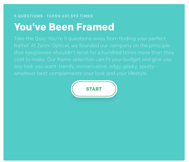
The Find Your Frame quiz from Zenni Optical has been taken almost 600,000 times.
Test
This is not a test as in “A/B testing” (which is important, too) but as in “Test your knowledge”, “Test your skills", and “Test your readiness".
Like assess formats, test CTAs tap into our desire to see how much we know or how much we need to learn. We use this data to make and justify our decisions and to guide us toward areas where we want or need to learn more. This is particularly helpful when we (or our prospects) are not sure we are ready to dive in – or even what we might be diving into.
For prospects at the discovery or consideration stage, for example, it might be impossible to get them to commit to downloading and reading a white paper. Still, that person is looking for something – an information gap waits to be filled – and a test can be the right mix of information and efficiency. Emails and landing pages that call on prospects to “test” instead of “download” offer a more personalised CTA because they promise an individual result.
As a marketer, tests and assessments also are opportunities to develop and play with brand personality. Marketers can showcase their brand and expertise through unique graphics and language, creating a memorable experience and setting the stage for future outreach.
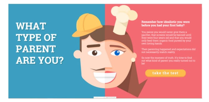
Funifi used an entertaining parenting quiz to grow its audience, adding 2,700 emails to its subscriber database in 72 hours.
If this has given you food for thought and you are looking for more, head to the Content Marketing Institute's website for the full article, 5 Interactive Calls to Action That Prospects Can’t Resist, and for more helpful tips and tricks on Inbound Marketing, subscribe to our blog and download our free ebook below.


